Berserkers Team Rzeszów
The first move is yours.
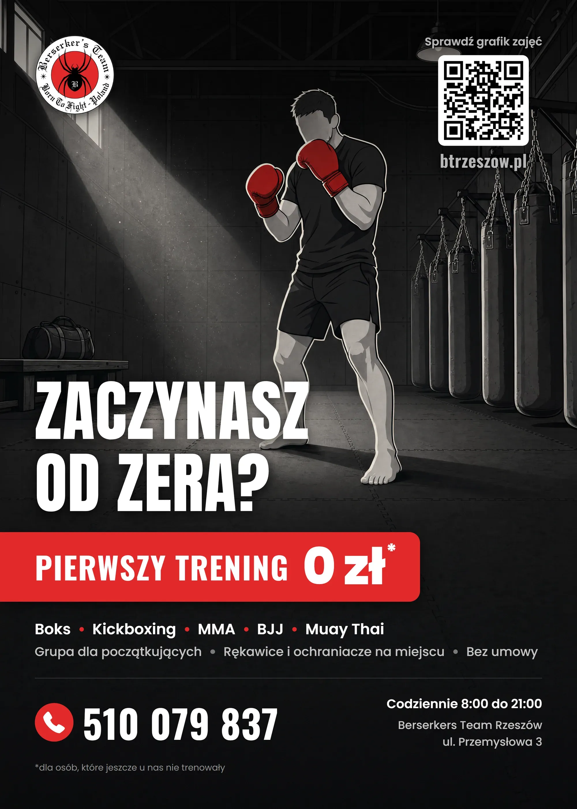
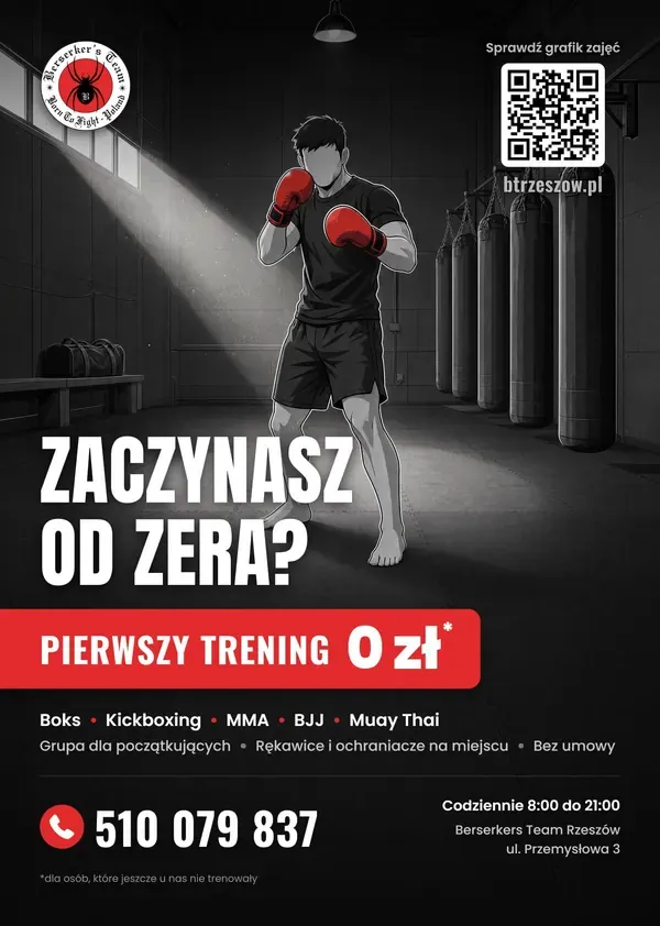
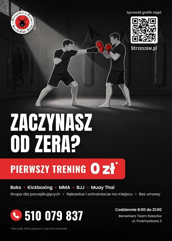
Someone considering their first training session often starts with doubts. The Berserkers Team Rzeszów poster addresses that moment with a strong question, illustration and a clear contact.
The task
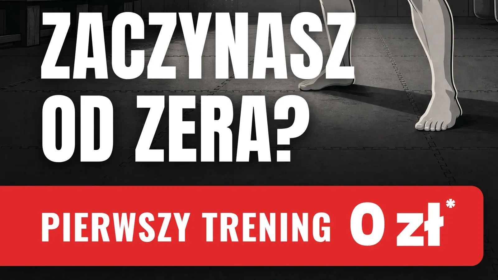
The headline speaks straight to a beginner’s fear: “Zaczynasz od zera?”. It doesn’t promise fitness or results. It simply invites you to a first session for PLN 0.
Project decisions
Grayscale and exactly one red.
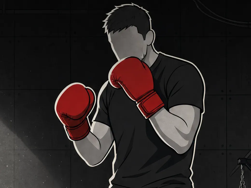
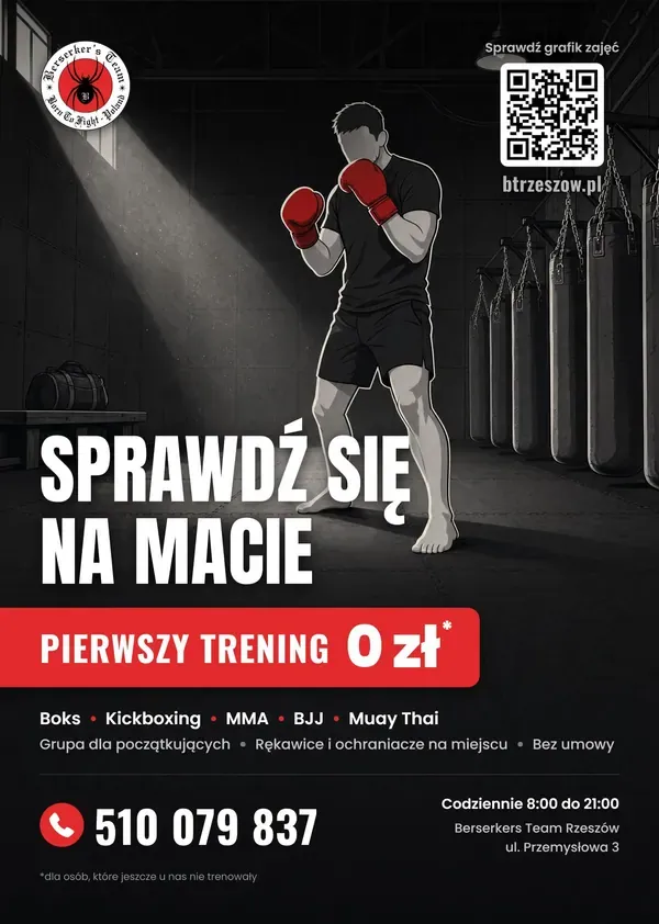
The club has a consistent identity: vector illustration in grayscale with one accent, the red of the gloves. Flat color areas, a thick dark outline, two-tone shading and paper grain. A photorealistic version was ruled out from the start. The gym got dense detail: panel seams, the roof truss, bag chains, dust in the beam of light. Up close, you look at it like an illustration. From two meters, it works through silhouette and contrast. Red appears only where it has a job to do: the gloves, the offer bar, the list bullets and the phone icon. “0 zł” stays white so the red keeps its punch.
The hook and the offer read as one.
We set the title in Anton, the offer label in Oswald and “0 zł” in Poppins at weight 800, the same figure that runs in the club’s Meta Ads. The title moved down from the top of the sheet to sit above the red bar, so the question and the answer stand side by side. The bar bleeds off the left edge, and its right end has a 4 mm radius like the icon next to the number, so both red elements belong to one family. No bottom gradient. It darkened half the poster, so the text sits directly on the mat, and readability comes from the shadows under the letters and the calm, dark bottom of the illustration.
Nothing important closer than 10 mm to the trim.
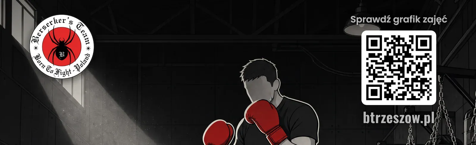
The trim size is A4, 210 x 297 mm. The file has 3 mm of bleed on every side, which makes 216 x 303 mm, or 2551 x 3579 px at 300 dpi. We convert color to CMYK with the Coated FOGRA39 profile and a 330 percent ink limit. The PDF has a MediaBox equal to the full bleed size, a TrimBox inset by 3 mm and a BleedBox equal to the MediaBox, so the print shop sees the bleed and the trim line without having to ask. Text and logo sit inside a safe area 10 mm from the trim line. The center of the sheet keeps the illustration’s native sharpness, because nothing was scaled. The added frame lies outside the safe area and mostly gets trimmed off.
Project materials
What we made
Concept, copy, illustration, typography and print-ready artwork. Red guides the eye and one clear message holds the hierarchy. Prices and offers shown belong to the club’s historical campaign.
The poster documents a past recruitment campaign. Visible terms and prices belong to the club’s offer at the time.