420 Perspektyw
A voice you can see.
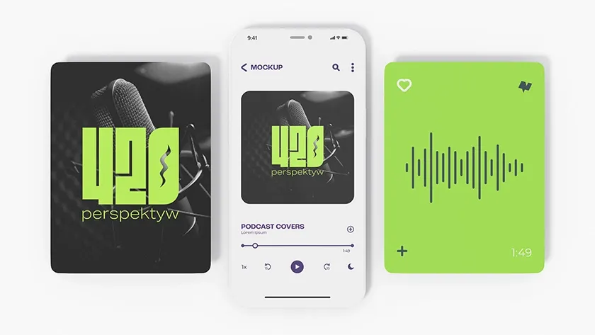
The identity of 420 Perspektyw: a mark, podcast cover and social-media materials.
The task
A podcast is sound, yet people often encounter it as a small cover first. Its name and character must remain clear at that scale.
Project decisions
Typography as the mark
Boldly constructed 420 numerals form the main symbol. A quieter “perspektyw” line completes the name and gives it hierarchy.
A language for several formats
A green accent, dark photographs and an audio waveform travel between the cover and social assets. Seeing the applications together reveals the system’s continuity.
What we made
A coordinated identity with logo, cover and promotional material. The scope covers visual design, not production of the podcast episodes.