SunGrant
Contact in the brand’s colours.
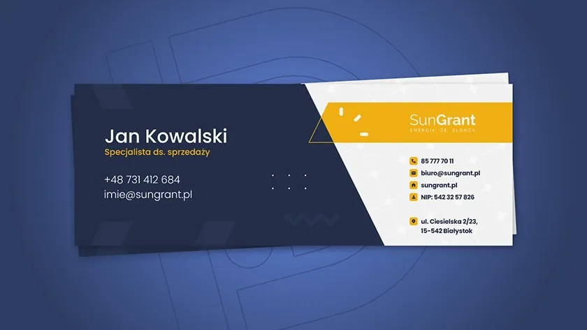
A two-sided SunGrant business card: the person on one side, company details on the other.
The task
Every element takes meaningful space on a small format. Readable contact details need to work with the renewable-energy brand’s identity.
Project decisions
Person and company have their places
The navy side emphasises name, role and direct contact. The light side groups the mark, address and company details, avoiding one crowded block.
One accent, different functions
Yellow appears around the brand and contact icons. Geometry and a subtle panel pattern connect the practical item to solar energy.
What we made
The design of both sides and its presentation. This is a specific item, separate from the social-media creative.
Details on the mockup document the project, not DigiDraft contacts.